Analyzing where I spend my time helps me reflect on where I can be more efficient and identify where support is needed in the future. I needed a way to better accomplish this analysis – and Yahel (one of Sidney Shapiro’s students in Data Analytics) built for it for me in a way that could be useful for others. For this to work you need an updated version of Excel and Outlook.
Working with Yahel has been extremely positive in trying to solve this problem. She is responsive and always has a positive attitude. The problem was not easily solved and there exists no comparable tool online right now. With this tool I can now better analyze where my time is spent to help me find efficiencies as well as advocate for support in delivering high quality education to my students.
Step 1: Accurately Track Your Time in Outlook.
Step 2: Export Your Calendar Data
This step needs to be done on your home computer. You may need to install Outlook at home and set up your account before beginning.


Select the calendar you want to export.
In this next step, you need to save your file to the path “C:\Exported Calendar\Calendar Info.CSV” or learn how to edit macros in excel. I recommend just saving it exactly as shown. Each time you export your calendar data you will need to overwrite this file.

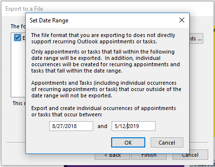
If you have already exported your calendar before you will need to agree to overwrite the file. Agree. Click Finish. Set the date range that you have accurate data for.

Step 3: Import Your Data
Download this file, save it to your computer. It will not work in Google Drive.


Go to the Import Data tab and click the buttons in order.
“Delete Old Data Source” removes existing data from the dashboard. Do this every time you import a new date range to avoid duplicate data.
“Import New Data” takes the file from “C:\Exported Calendar\Calendar Info.CSV” and imports it into this dashboard.
“Delete All-Day Events” removes any events that are scheduled for the full day as they do not accurately represent time worked (for most people). You may need to double check that all-day events that span over several days were properly deleted. To simplify your life just delete or don’t use all day events in your calendar.
“Update Data Table” to make everything work.

Step 4: Complete Your Analysis
The help tab in the documents explains how to use the documents and dashboard. Under the Analysis tab you can filter the tables using the start and end date slicer.

Categories are generated based on what you used in your calendar. See this blog post for information about how to use categories. If using this function it is a good idea to limit the number of categories.

Double check that the data makes sense. Look at the category table. If any of the numbers look too big, double click on the number it to see a detailed table of the data. I can also see by looking at this table that I should go change some items in Outlook that have more than one category to be assigned to just one.

For example, in this case I need to delete “Away at online learning” from the table. Although it was scheduled as an all-day event the calendar export did not label it as such. Therefore I can delete it in the source data or in my calendar (or both). I prefer to make edits directly in Outlook because that way it is fixed for all future exports.

You can also display data by adding key-words under the “Subject- key words” tab. After updating your list you will likely need to click on the “Update Data” button.

Key words are a great way to break down data for units of analysis. By looking at this chart I can easily see where most of my time went in this course.

Example table showing time spent on tasks filtered for one course with some key words added. The “0” is for hours that are not captured by the key words.
Improvements
Based on today’s discussions we are updating the dashboard to provide statistics on weekend and evening work hours. I will update the file in this blog post once it is ready. We are also changing the table to have the chart say “No Key Work” instead of “Uncategorized.” If you have any other feedback please let us know. If you have any questions, suggestions, or need technical help please reach out to myself or Sidney.


1 Comment
Essaywriter · May 15, 2019 at 6:57 am
Thanks! And thanks for sharing your great posts every week!